

10 Doddles in Illustrator
This is my first attempt at using Illustrator. I had to use multiple tools for each image, and this allowed me to get a hang of the program.


Vector Celebrity Portrait
Vector Snowboards

Art Logo (An in class design for the Art department)

Logo Design
Logo 1: The graphic is a representation of my love for cats, but also my attitude. I really liked this combination of this logo and it's text because I could see it as a logo that could easily be massed produced. The best part of this design is its simplicity and boldness.
Logo 2: I modified the text to appear flowing, and curious which are some traits to describe me. I also included the world because my family travels a lot.
In my opinion, the best part would be the stretching of the A and the K. It really gives off that flowing feeling, and it ties the piece together.
Logo 3: I chose a T.V. for my symbol because I really enjoy watching the latest shows. My family also enjoys watching T.V too.
First, explain the assignment:
We had to create a classroom logo that is a combination of two unique school subject, and we were only allowed to use three colors.
Explain your choice of graphics and how they represent the class:
I chose a camera and a line of flasks.The camera represents photography and the flasks represent science class. I wanted to you flasks because in photography it's common to take pictures of still life. I think it would be reasonable for a photographer to take a cool picture of flasks.
How did you connect/ combine the graphics?
I moved the line of flasks into the line of sight of the camera. I also deleted a lot of reflections that came with the camera clipart.
Explain how you made text a part of the design
I copied the pre-made outline of the camera and then used the text tool to have the text wrap around the camera.
What is your favorite part of the logo?
My favorite part is the flasks themselves. I like how I added a little highlight to some of the flasks. and the color choice/
Any weak areas?
I'm okay with my color choice, but I don't think color choice was best for the camera. Although, I don't know what other colors I would use besides leaving the camera black and white.

Crazy Class Logo


Final Corporate Identity Project Reflection:
Explain your choice for the company you created. Why this particular company?
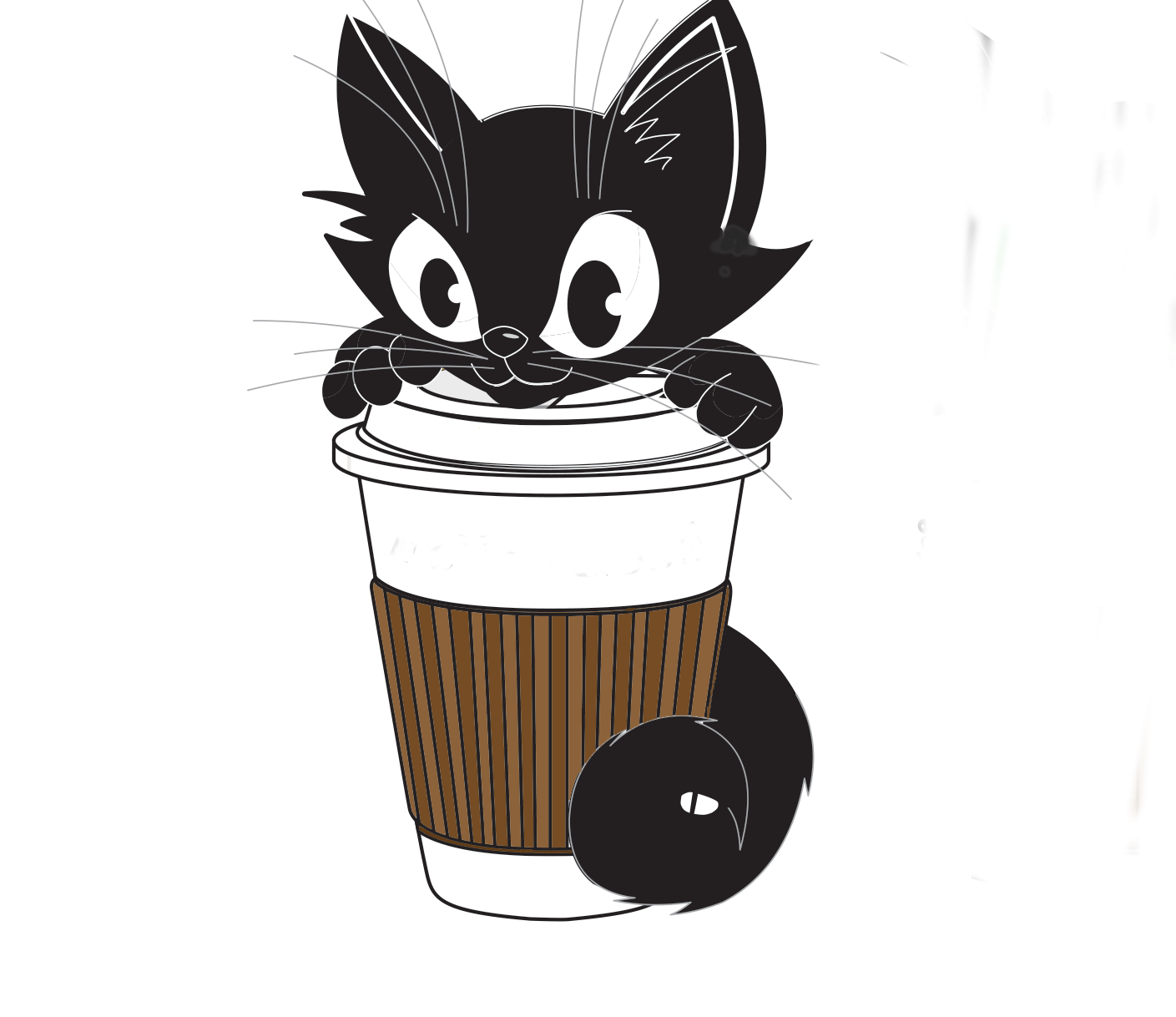
I chose to make a logo for a cat cafe simply because I've always wanted to go to one. Also, I really enjoy cafe settings and cats.
Explain the logo - how did you tie in your company identity through your graphics?
I cut out a clipart of a cat on top of a pumpkin and I placed it on a clipart coffee mug. I really think the bright, but calming colors pull in the atmosphere I would like to have in my cafe.
Explain your selection of font - the text you used for the name of your company
I chose the font that fit the tone of the message. Bold ones for titles and silly one for identification.
Explain your color palette.
My color palette consists of light green, pink and brown. I chose these colors because they are comforting.
Do all of your company items, business card, envelope, letterhead and animation look like a matching set and how did you make sure of this?
I think they do, and I made sure to use the same colors in each one. If that doesn't tie them together then hopefully the logo does.
What was the biggest struggle during this project?
Choosing the right font especially for the logo. I feel that the font I chose for the original logo was too bland.
What is your favorite part of the project?
The animation because I had no idea you could animate images so easily in photoshop.